The template I send you has several layers:
Regular guides
Thin mortar
Wide mortar
Cracks, broken, cracked
Colored background
Background
(depending on which template you can change some name or include some extra layer)
Before you start doing anything, I advise you to make a copy of the layers and leave them “invisible”. Thus, if during the process you make a mistake and damage or move any of them, you will always have a correct copy there. You don’t have to manipulate the “background” layer at all. So I will only refer to the others.
These changes are very simple. You can go to the “your color” layer (or a similar name) and change the hue.
Try raising and lowering the opacity of the layers, delete or contrast some of them…
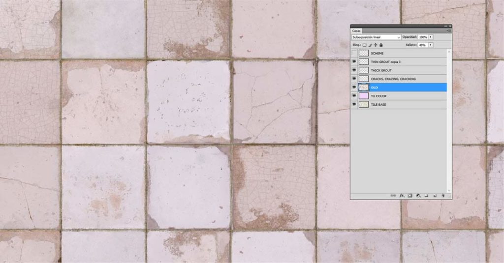
layer “your color” pink
“old” layer linear underexposure: 49%
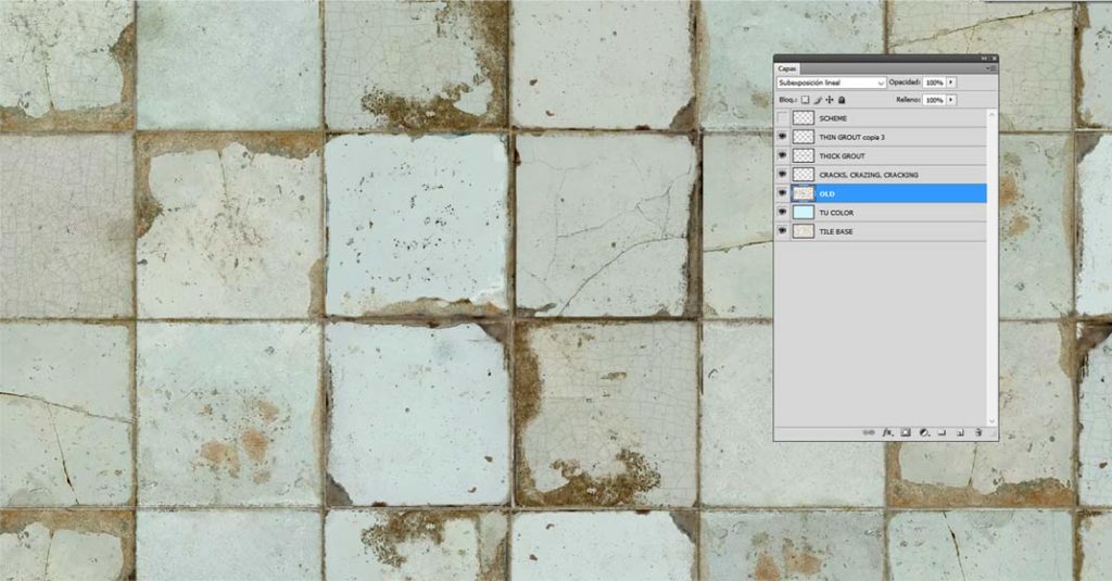
layer “your color” blue
“old:” layer linear underexposure: 87%
In this video you can see how we do it:
It is essential that you see the tutorial so that you understand how you have to work the template that we will send you!!!! If you’re just going to change the background color of the tiles, watching the first tutorial will suffice:
1 – choose the hundreds or drawings you want to include
2- make all the layers invisible except the one on top of all (named “scheme”, “reguares” or similar
3- start placing your drawings perfectly adapting to the visible grid. When you have all placed group them all in a single layer. You can also try assembling them in groups (not one by one)…
VERY IMPORTANT!!!!!! Don’t dock any other layer with the new drawing!!! You have to keep the layers SEPARATE.
Thus, as we mentioned at the beginning, if you make a mistake and damage it, you can always recover it.
4- make all the layers visible and make the “regular guides” invisible. Next, with your new drawing layer, try out the different effects you can get by simply changing the way the layers look:
Select some drawings and duplicate them to give them a different effect than the rest
Remove some border, as if a tile had been lost and replaced by a plain one
change “exaggeratedly” the tone of a tile…
VERY IMPORTANT!!!!
On the perimeter of the image, you will see that there are some marks like this (or similar)
In the center, above and below and on the right and left. Check that all the layers ARE IN THE SAME PLACE!!!. Sometimes, without realizing it, you may have displaced some of the layers, and the whole work would look bad.
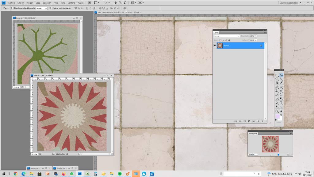
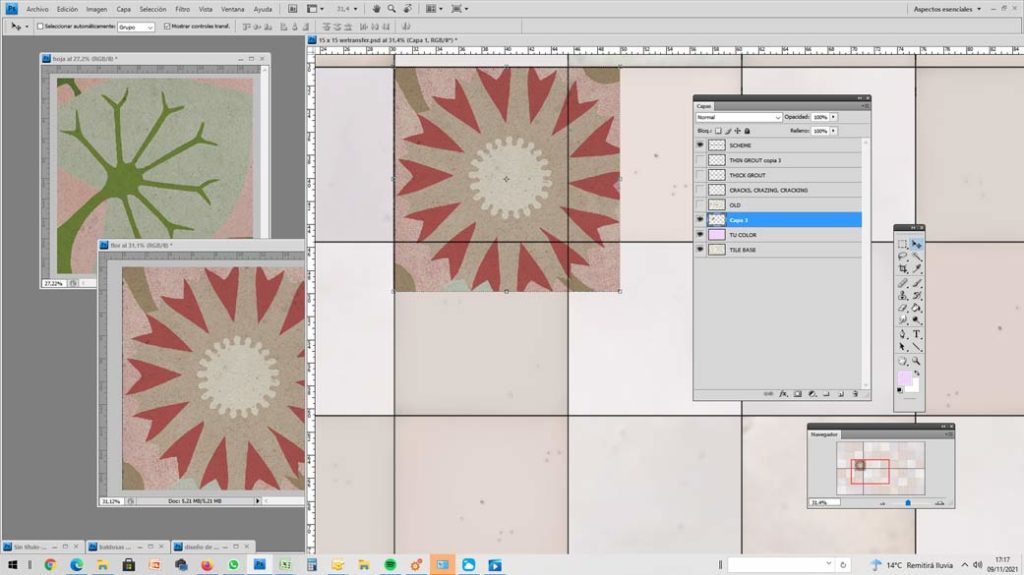
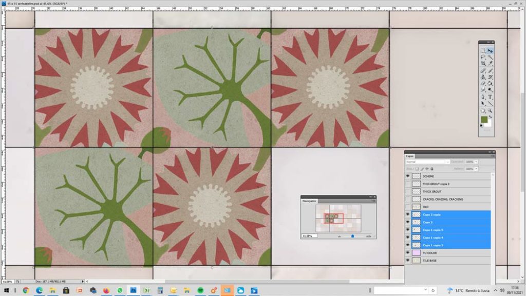
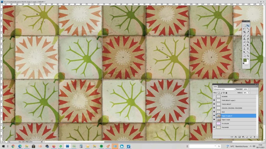
We have achieved the effect of the last image by duplicating the border layer. The one that is below we leave it in “dodge color” 100% and the one that is above we leave it in “underexpose color” 58%
In this video you can see how we do it:
If you are going to include drawings or borders, also look at this:
We propose 6 types of design:
COLOR
VERY EASY
EASY
SIMPLE COMPOUND
COMPOUND
MURAL
Obviously the easiest to do in all tile models, (and the most used!); both in the aligned, as in locked
We will send you a layer of color already placed in the template you have chosen, and you will only have to modify it in a very simple way.
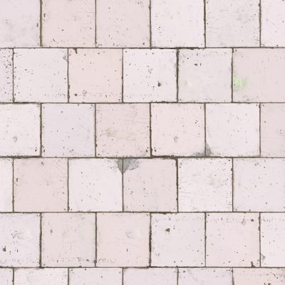
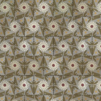
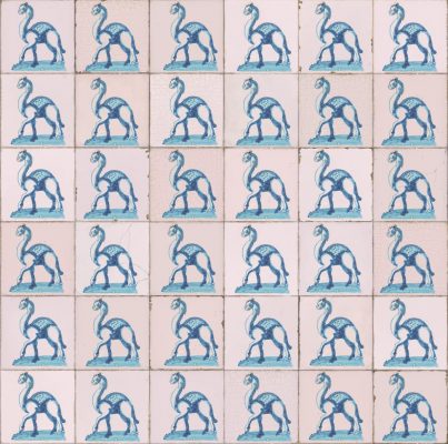
All tiles are the same, and their orientation does not matter (you can flip the planks and the borders will still look good)
Very easy to assemble in all tile models; both in the aligned, as locked
We will send you the design already placed in the template you have chosen. You will not have to worry about its placement, since in every way it will work well.
Although all tiles are the same, their orientation is important (you can’t flip the tiles because the borders would be upside down)
We recommend that you only use it on models align
We will send you the design already placed in the template you have chosen.
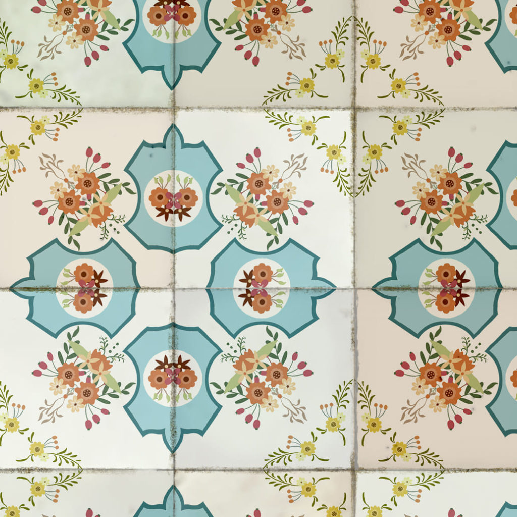
The drawing is formed by the composition of several tiles (maximum 4).
Imagine that you choose a tile pattern that is made up of odd tiles, with a composition of 4 tiles. The designs are cut in half and when you assemble the plates, no matter how many turns you give them, you will not match them well, as you can see in the following images:

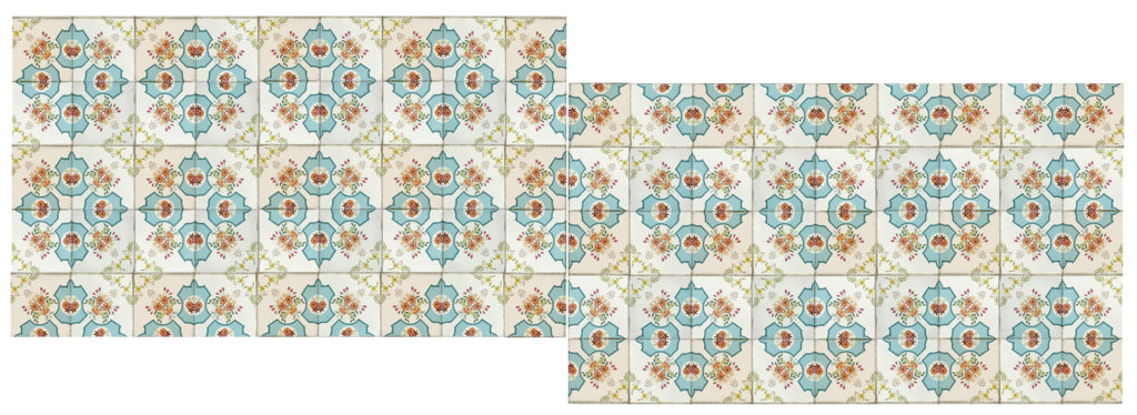
You can do it in 2 ways:
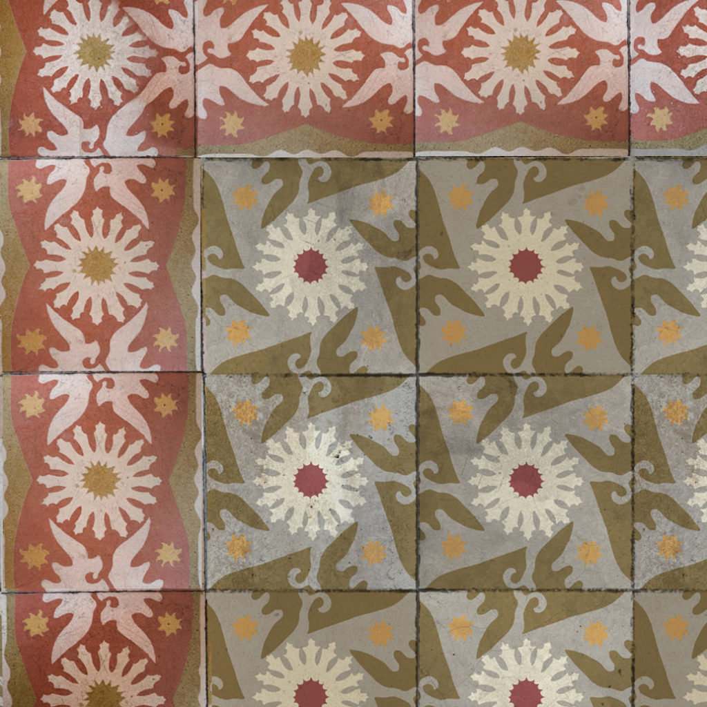
a. the most studied template design work to facilitate placement on the set (before starting to place the tiles on the template you will have to do a study to make the correct design and “cutting” of each of the plates)
b. the simplest template design, and the most complex set placement (design entire plates with the different types of tiles, to later cut and assemble the set in the appropriate way)


If you want to make a mural, you have two options:
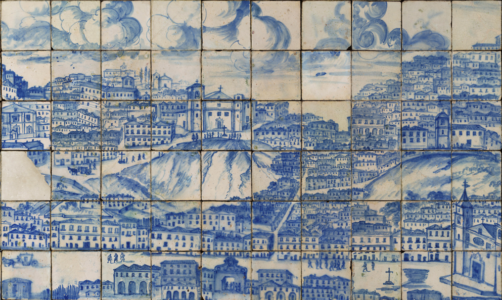
Use the photo of a real tile mural
We have experience with this type of work and spectacular results are achieved. If the photography is well done, it is a highly recommended option.
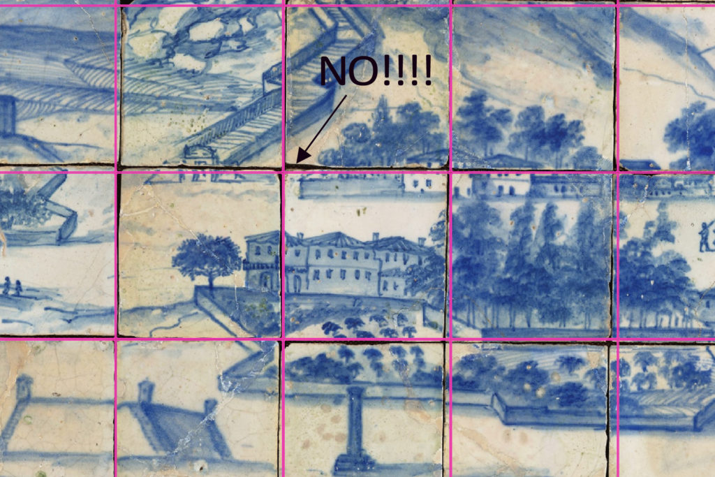
What drawbacks can you find?
Use a non-tile image
Use the image of a painting, engraving, watercolor… and “enter” it in the template.

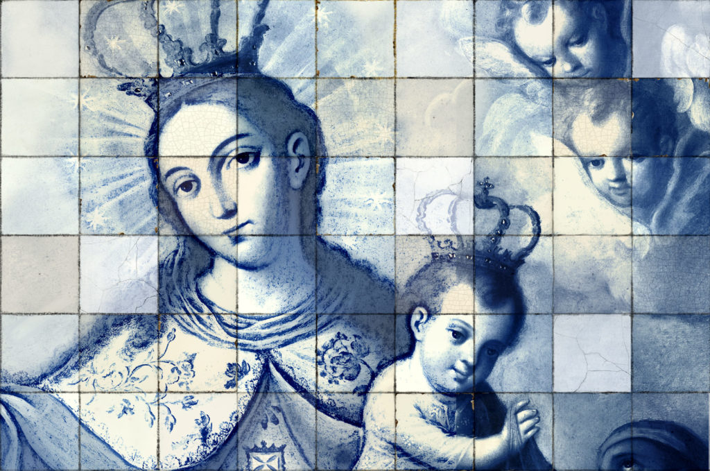
At the end of the modifications we recommend do a montage of the plates to see what look you’re getting (make a small copy, not “heavy”) and you can correct them before we go to print them.
Next, you will see in the example a design “fault” that you should avoid, and which you will realize when you make the assembly that we recommend:
By putting a “peculiar” element such as the tile with a different tone, when you place the plates in the set, there will be a lot of repetition. That is why we give you the following advice…
Always try to make designs as “homogeneous” as possible… namely; (using the example above) don’t include a tile so different from the others, or make such an obvious mark. You will give them the “character” with paint or whatever you want when you have them placed and mounted in their final location…!!!
If in any case, you prefer to include “peculiar” elements, you can send us a different design for each plate… keep in mind that this will not have any extra cost in your budget!

Good luck and good luck! You will see that it is much easier than it seems!
©2024. laWALL. All rights reserved.